Source: https://web.natur.cuni.cz/~langhamr/lectures/vtfg1/mapinfo_2/barvy/colors.html
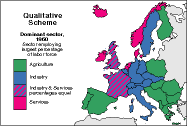
Ordinal data is a categorical data type. It may consist of
some type of ranking from low to high, it could range from village, town, to
city, or it could be variations in symbol color and size, all in order to
indicate an increase in value. Ordinal data scales usually measure non-numeric
concepts. Ordinal is represented with unique values maps. Below is an example map that shows ordinal data.
Source: https://www.e-education.psu.edu/natureofgeoinfo/book/export/html/1553
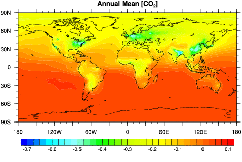
An interval scale is a regular numeric scale. In this case,
the order of the values is known along with the exact differences between the
values, unlike with ordinal data. Some good examples of interval data include
the Celsius temperature scale, the pH scale, and time, because in both of these
cases the increments between each value is known and measurable (as well as
consistent). One thing to remember about interval data is that they do not have
a “true zero” or absolute zero. Without an absolute zero, ratios cannot be
computed. Interval data is represented with quantities maps. With interval data
addition and subtraction can be done. Below is an example map that shows interval data.

Source: http://support2.dundas.com/OnlineDocumentation/RSMap/DesigningMaps.html
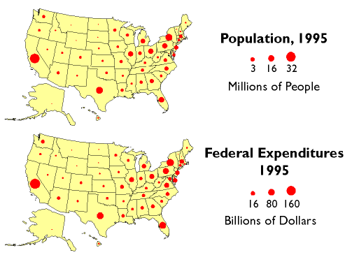
Ratio data tell the order of the values, the exact number
between each value, and they also have an absolute zero. Some examples of ratio
data include height, weight, population, and rainfall. Ratio data having an
absolute zero allows for a wide range of descriptive and inferential statistics
to be applied to it. Addition, subtraction, multiplication, and division can be
done with ratio data. Quantities maps are used to represent ratio data. Below is an example map showing ratio data.
Source: http://sites.uci.edu/randersonlab/available-data-2/
The goal of part two of this assignment is to provide maps
that will presented to potential clients as a new hire to an agriculture
consulting/marketing company. The company is interested in increasing the
number of women as the principle operator of the farm. The company should
concentrate their message in areas that females tend to visit a lot, and areas
where farmers may go in their leisure time. Bringing this message to places where
females and farmers commonly spend leisure time would be an effective way to
draw them in to look at the message. Three maps will be created for this
project. The three maps will be equal interval based on range, quantile, and
natural breaks. Equal interval based on range is a classification method where
each class has an equal range of values. This can be used when data is
distributed evenly. The quantile classification method is when each class has
about the same number of features. The natural breaks method is when data
values that cluster are placed into a single class. Class breaks are when there
is a gap between the clusters. This method can be used when data is distributed
unevenly. Once these maps are completed, the next step will be to decide which
map would be best for the potential clients to see and explain why this is the
best choice.
The first step in this process was to gather data from the
census fact finder website, the dataset chosen was: 2010 SF1 100% Data, and
then the geography was set to all counties in Wisconsin. After the data was
located, the next step was to download the shapefiles from this page into my
folder for this assignment in order to begin the project. The next step is to
open up ArcMap and prepare the Excel document for this assignment to be used in
ArcGIS as well as add the shapefile of Wisconsin that was just downloaded to
the map. To do this, it is necessary to add the data to the GIS platform. To do
this, the “add data” button in ArcMap is used to select “Sheet 1” to be added
to the GIS so the data can then be joined. To join the Wisconsin shapefile to
Sheet 1, the field that the join will be based on was set to Geo_ID, the table
to join to this layer was set to Sheet 1, and the field in the table to base
the join on was set to Geo_ID. The next step in this project was to change the
coordinate system to “USA Contiguous Albers Equal Area Conic” projection. After creating these three maps based on female farm
operation in Wisconsin counties, the final project can be seen below.
I think
that the map that should be shown to potential clients should be the quantile
classification method map. This map shows the most range of values, which can
be seen from the large area of maroon that covers this map, compared to the
maps from the other two classification methods. With more of a range of colors,
which represents different values of female operators in each county, this map
will be easier for clients to read and understand. The quantile classification
map also gives the reader a good idea of where female farm operators are most
concentrated in Wisconsin counties. When looking at the quantile map, it can be
seen that female farmers are most concentrated in central and southern
Wisconsin. Because of this, it makes sense that potential clients should direct
their marketing to these general areas in order to reach the largest number of
female farm operators. The strong variations in the value colors for the
quantile classification map was the greatest of the three maps created in this
project, and this is why it is the best choice to present to a potential
client.
No comments:
Post a Comment